What is responsive web design? A guide for business growth

If your website does not display correctly on a smartphone, you are losing customers before they even read a word. 72% of users abandon non-responsive websites, which means a poorly formatted site is not just a technical inconvenience, it is a direct hit to your revenue. Responsive web design (RWD) is the approach that fixes this. It ensures your site looks and works properly on every device, from a desktop monitor to a small phone screen. This guide explains what RWD is, how it works technically, and why it matters for your business growth.
Table of Contents
- What is responsive web design?
- How does responsive web design work?
- Why responsive web design matters for your business
- Modern approaches and challenges in 2026
- What most small businesses miss about responsive web design
- Transform your website experience with expert help
- Frequently asked questions
Key Takeaways
| Point | Details |
|---|---|
| Mobile matters most | Most users will visit your site from mobile devices, so responsive design is a must. |
| One website, every device | With responsive web design, a single website works seamlessly across phones, tablets, and desktops. |
| Boost conversions and trust | A responsive site improves user experience, which can increase conversions by up to 35%. |
| Stay ahead in SEO | Google rewards sites that are responsive with better rankings, making it easier for customers to find you. |
| Continuous improvement counts | Regular testing and updates keep your website responsive as devices and user habits evolve. |
What is responsive web design?
Responsive web design is an approach to building websites so they automatically adjust their layout, content, and visuals to suit the screen they are being viewed on. Whether a visitor arrives on a 27-inch monitor or a budget Android phone, the experience should feel natural and easy to use.
The concept was first formalised by developer Ethan Marcotte in 2010, and it has since become the standard expectation for any professional website. Understanding the web design landscape today means recognising that RWD is no longer optional. It is the baseline.
“Responsive web design adapts sites for devices using fluid grids, flexible media, and CSS media queries.”
The three core principles that make a site responsive are:
- Fluid grids: The page layout is built using relative units like percentages rather than fixed pixel widths, so columns and sections resize proportionally.
- Flexible images and media: Images and videos scale within their containers rather than overflowing or shrinking awkwardly.
- CSS media queries: These are rules written in the site’s stylesheet that detect the screen size and apply different layout instructions accordingly.
For a small business owner, the practical benefit is straightforward. You maintain one website instead of separate desktop and mobile versions. That means lower maintenance costs, a single place to update content, and better search engine optimisation (SEO) because Google indexes one consistent URL. The responsive design principles behind RWD are well established and supported by every modern browser and device.
How does responsive web design work?
With the definition in mind, let’s explore how responsive web design operates behind the scenes.
The core mechanics of a responsive site rely on three interconnected systems working together. Here is how each one contributes:
- Fluid grids divide the page into columns using relative units such as percentages, rem, or the CSS fr unit. When the screen narrows, the columns shrink proportionally rather than overflowing the edge.
- Flexible media uses CSS rules like "max-width: 100%` on images and videos so they never exceed the width of their parent container, preventing horizontal scrolling.
- Breakpoints are specific screen widths where the layout changes. Common breakpoints target mobile (under 768px), tablet (768px to 1024px), and desktop (above 1024px).
- CSS media queries are the instructions that activate at each breakpoint. For example, a three-column layout on desktop might switch to a single column on mobile.
| Device | Typical breakpoint | Layout behaviour |
|---|---|---|
| Mobile | Under 768px | Single column, stacked content |
| Tablet | 768px to 1024px | Two columns, condensed navigation |
| Desktop | Above 1024px | Full multi-column layout |
A practical example: on a desktop, your site might show a full horizontal navigation bar. On a phone, that same navigation collapses into a hamburger menu icon to save space. Your logo scales down, images resize, and text reflows. The user sees a clean, usable page regardless of their device.

Good site performance optimisation is closely tied to responsive design. A well-built responsive site, like this responsive layout example, loads efficiently across all connections.
Pro Tip: Avoid setting fixed pixel widths on any layout element. Use percentages or rem units instead, and your layout will handle unexpected screen sizes far more gracefully.
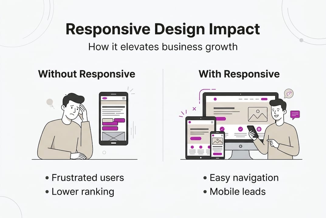
Why responsive web design matters for your business
Understanding the mechanics is important, but what does it mean for your bottom line?
Mobile traffic accounts for 58 to 60% of all web visits globally. That means more than half of your potential customers are viewing your site on a phone. If your site frustrates them, they leave. It is that simple.
The numbers are hard to ignore:
- 72% of users will abandon a site that does not work well on their device.
- Responsive design can increase conversion rates by 15 to 35%.
- Bounce rates drop significantly when mobile users can navigate easily.
- A single responsive site costs less to maintain than running separate desktop and mobile versions.
| Factor | Non-responsive site | Responsive site |
|---|---|---|
| Mobile usability | Poor, users struggle | Smooth, intuitive |
| SEO ranking | Penalised by Google | Favoured by mobile-first indexing |
| Conversion rate | Lower due to friction | Higher due to ease of use |
| Maintenance cost | Higher (multiple versions) | Lower (one codebase) |
Google switched to mobile-first indexing, which means it primarily uses the mobile version of your site to determine your search ranking. A non-responsive site is not just a user experience problem, it actively suppresses your visibility in search results.
For small businesses, the competitive edge is real. A site that works everywhere builds trust instantly. Visitors who land on a clean, readable page on their phone are far more likely to enquire, book, or buy. You can see this in action with conversion-focused design that prioritises the mobile experience from the start.
Modern approaches and challenges in 2026
As responsive techniques evolve, several advanced approaches and real-world challenges have emerged.
Modern RWD now goes beyond simple breakpoints. Two approaches worth knowing about are:
- Mobile-first design: Rather than designing for desktop and then scaling down, you start with the smallest screen and build upward. This forces clarity and prioritisation of what actually matters on a page.
- Container queries: A newer CSS feature that lets elements respond to the size of their parent container rather than the overall screen width. This makes individual components far more flexible and reusable.
Common challenges businesses face include:
- Navigation on very small screens, where complex menus become unusable.
- Data tables that overflow on mobile and require horizontal scrolling.
- Performance on slow mobile connections, where large images or heavy scripts cause frustrating delays.
- Foldable and ultra-wide screens, which introduce new edge cases that older responsive approaches did not anticipate.
Best practices for 2026 include testing on real physical devices rather than just browser emulators, avoiding fixed pixel values throughout your CSS, and using lazy loading so images only load when a user scrolls to them. Tools like Google Lighthouse and Core Web Vitals give you measurable scores for performance, accessibility, and responsiveness.
A well-built business web app demonstrates how these principles come together in a real product. Pairing strong responsive structure with responsive design frameworks gives your site a solid, future-proof foundation.
Pro Tip: Run your site through Google Lighthouse monthly. It flags responsiveness issues, slow load times, and accessibility problems before they start costing you customers.
What most small businesses miss about responsive web design
Having covered the technical side and challenges, here is what businesses often get wrong, and what actually drives results.
Most small business owners invest in making their site look attractive and then consider the job done. The visual polish matters, but it is only part of the picture. What actually determines whether a visitor converts is how fast the page loads, how easy it is to find what they need, and whether the experience feels effortless on their device.
Ignoring performance optimisations is one of the most common and costly mistakes. A beautiful site that takes six seconds to load on a mobile connection will lose visitors before they see a single image. Expert guidance consistently points to testing on real devices, optimising for performance, and prioritising usability as the factors that separate effective sites from expensive ones.
Responsive design is also not a one-time task. Devices change, browsers update, and your own content evolves. A site that worked perfectly on launch can develop issues six months later if nobody is checking. Investing in performance for WordPress sites and scheduling regular audits is just as important as the initial build. Treat your website like a business tool that needs maintenance, not a brochure that gets printed and forgotten.
Transform your website experience with expert help
If you are ready to put these responsive insights into practice, expert support is just a click away.
A professionally built responsive website does more than look good on a phone. It builds trust, reduces bounce rates, and turns more visitors into paying customers. At richharrington.dev, custom website development is built around exactly these principles, with mobile-first thinking and performance baked in from day one. Browse the full range of services to find the right fit for your business, or schedule a consultation for a free website review and find out what your current site might be costing you.
Frequently asked questions
What makes a website responsive?
A responsive website automatically adapts its layout and content to fit any screen size using fluid grids, flexible images, and CSS media queries.
How can I test if my website is fully responsive?
Resize your browser window, test on several physical devices, or use Google Lighthouse to audit how your site performs across different screen sizes.
What is the difference between responsive and mobile-friendly web design?
Responsive design adapts content automatically for all devices, while mobile-friendly sites are optimised for small screens but may not adjust correctly for tablets or large desktops.
Why is mobile-first important for responsive web design?
Mobile-first ensures your site performs well for the majority of users, since 60% of web traffic now comes from smartphones and tablets rather than desktop computers.
Recommended
- Understanding the Web Design Landscape in Swindon | Rich Harrington
- Web Design Swindon | Rich Harrington - Custom Website Development
- The Pop Guide | Rich Harrington Portfolio
- B2B Connections | Rich Harrington Portfolio
- Why website redesign drives business growth in 2026
- Enterprise Website Best Practices for Rapid Growth - 40Q